Every piece of art has a mood. Our job is to read it and build a frame design that supports it without getting in the way.
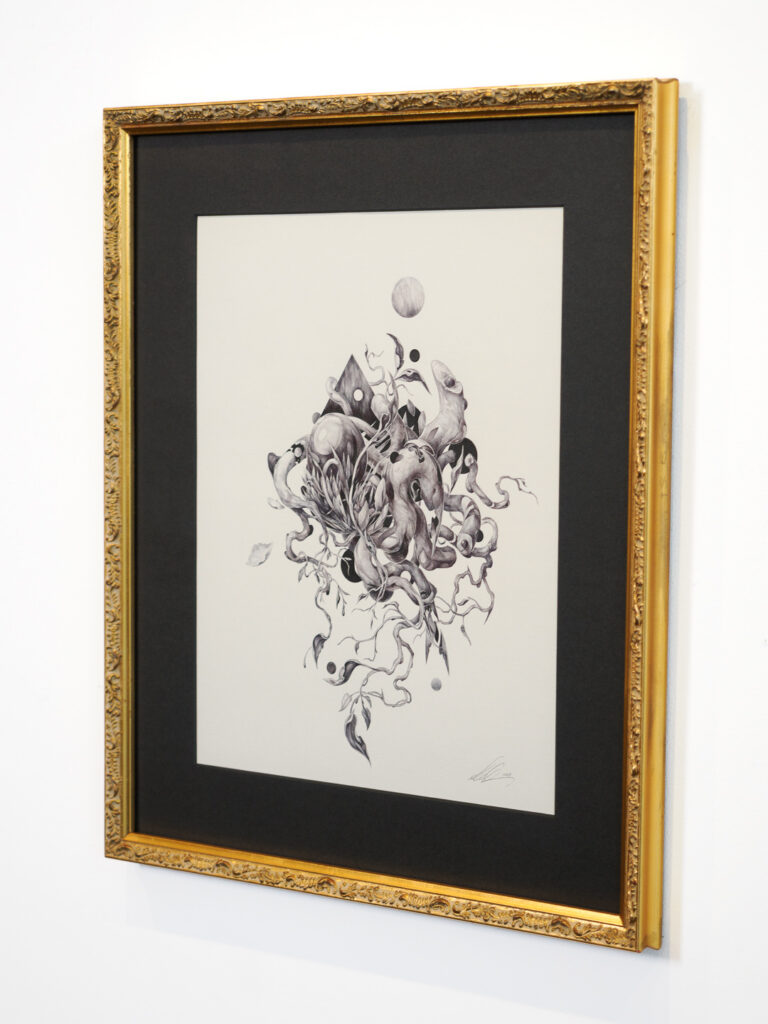
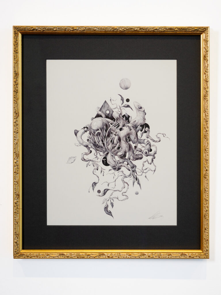
This graphite drawing by Baltimore artist Josh Chance is a good example of how that process works in practice. His intricate maze-like work captures a kind of beautiful anxiety, dense with detail and dark with intention. It is the kind of piece that changes the energy of a room the moment it goes up. The framing needed to understand that.
How our design process starts
When a client comes in with a piece, the first thing we do is look at it together. Not at the wall it is going on, not at the room it is going in, not at a catalog of frame options. At the piece itself.
We talk about what draws them to it, what they want to feel when they look at it every day, and where it is going to live. Those conversations tell us more about the right frame than any checklist. From there we start pulling options, laying things out on the table, and working through what each combination does to the art in front of us.
It is a collaboration. We bring the expertise and the options. Our clients bring the personal connection to the piece and often the most instinctive eye for what feels right. The best designs usually come from both sides of the counter.
The mat that started as black and revealed itself as charcoal

For this Josh Chance drawing our client made a choice that looked simple on the surface and turned out to be exactly right on every level.
She chose what appears at first glance to be a black mat. In certain light it reads as nearly black. From a different angle it reveals itself as a deep, rich charcoal that shifts and breathes with the light hitting it, picking up the different graphite tones in the drawing in a way a flat black mat never would have.
The mat has a smooth, contemporary surface with no texture. That clean quality continues the visual language of the drawing itself, a piece that is all about precision and control, while still giving it a contemporary framing context that feels right for where it is going.
The frame: a quiet contradiction
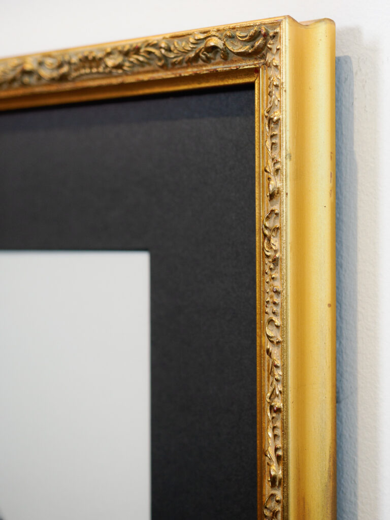
Paired with that smooth contemporary mat we chose a slim ornate antique gold frame with scuff marks worked into the finish. It is a deliberate contradiction that adds to the mood of the whole piece rather than resolving it too neatly. The ornamentation is subtle enough not to compete with the drawing, and the worn gold finish adds a layer of history and unease that suits Chance’s themes perfectly.
The whole design amplifies what the art is already doing. That is always the goal.
Every design starts with the art
We frame drawings, paintings, photographs, posters, prints, objects and memorabilia at our Castro shop. The medium changes but the approach never does. We start with what you bring in, we listen to what you tell us about it, and we design from there.
If you have a piece you have been meaning to frame, come in. You do not need to know what you want before you walk through the door. That is what we are here for.
📍 Visit our Castro frame shop 📞 Call us 📧 Email us your artwork 💻 Request a quote on our website
Underglass Custom Picture Framing · Castro District · San Francisco Custom design · Conservation framing · Delivery & install · Open 7 days